monaco Quilt Design
Join me this April, 2021, as I share my process for interpreting a 1935 Art Deco poster of the Monaco Grand Prix into a 44 inch by 66 inch quilt! Hint: I use the engineering design and problem-solving process a lot! Even math gets a workout!
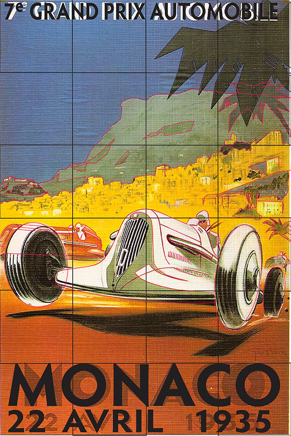
The end goal... interpret this poster iN fabric!
I started on this quilt years ago… but never finished solving all the problems needed to implement this design into fabric. What better time to finish than now?
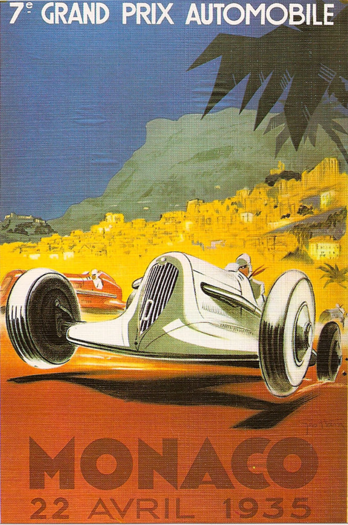
This is a scan of a 4″ x 6″ post card purchased years ago in Monaco. My husband is a Grand Prix racing fan, and I’ve always loved Art Deco posters. This is one of my favorites… I just love the colors!
I started on the design years ago, building a fabric palette to represent the colors. I even started on the main appliqué for the car. My goal was not to use raw edge appliqué if at all possible… I may have to break that resolution for the palm trees.
One of the main challenges is how to add the background details in… and how many are really needed. The yellow section is the biggest challenge for me, although adding the second car and additional details on the white race care will probably require more than just appliqué details. Options include:
- embroidery / top-stitching from right side of fabric
- bobbin work (which means using thicker decorative threads, cords or ribbons wound on the bobbin to show on the front side… this allows you to work with threads that can’t easily go through the needle)
- fabric painting
- appliqué
Check out the final quilt (below, left) to see my interpretation of this wonderful art-deco postcard & poster!
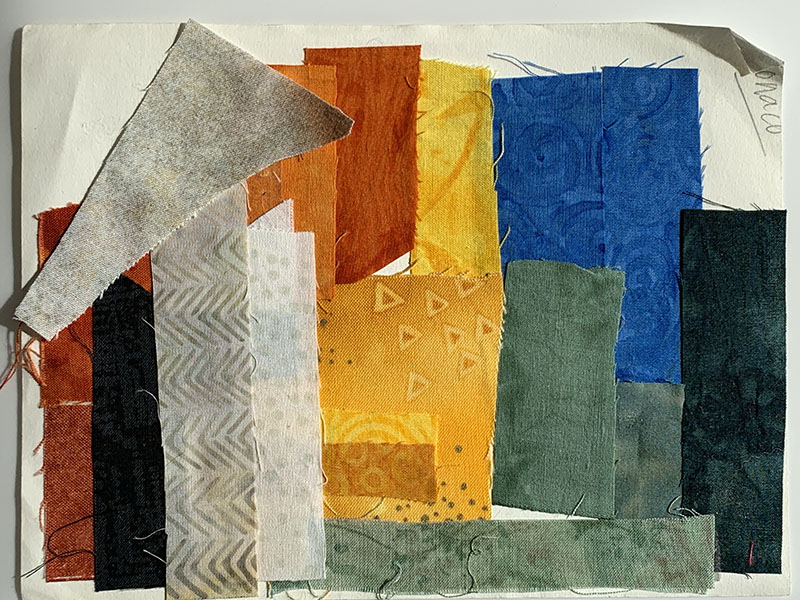
step 1 - fabric palette
A painter uses a palette of paints… a quilter uses a palette of fabrics. My first step when designing a quilt is usually to build my fabric palette… deciding which fabrics to build my design around. Sometimes this means going shopping for more!
See the gold fabric in the center with triangles and spots in the design? That’s the fabric I plan to use for the gold section with houses and villas… I can use some of the details already in the fabric, but I will have to add in more.
Part of the challenge is finding and using fabrics that I love… and figuring out how to add additional detail… or where I can live without it!
STEP 2 - SCALE / Grid & Design Wall
I’d already decided on a scale… 4″ x 6″ scaled up to 44″ x 66″ … and I’d left some Photoshop and Illustrator files with scaled up images and even a font selection to update the text with. I’d started on the car appliqué, and the shadow appliqué.
Design Wall
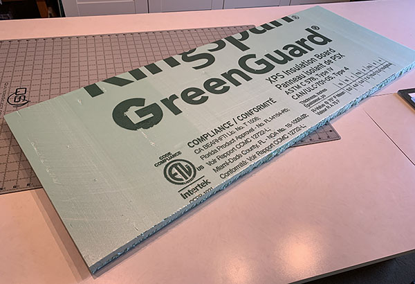
My first step this April was to make a new design wall (I have 3 others in use!) These are a huge boon to any serious quilter and are easy to make.
Materials:
- 4′ x 8′ x 1″ green insulation board (available at Lowe’s or similar). I cut mine down to 78″ long, leaving a piece 18″ x 48″. This allows it to fit under doorways in our house.
- Two pieces of fabric cut 2″ wider and 2″ longer than your insulation board piece. I use black for one side, a light neutral for the other.
- Circular needle
- Straight pins (T-pins are wonderful!)
Here’s the insulation board I use:
I use home dec fabrics, typically 54″ wide. These are a little heavier than quilting cotton. Solids work great for photography… easier to crop backgrounds out, but I have used a beautiful textured creamy home dec fabric for the light neutral side in the past.
*** Always trim off selvedges from your fabric before cutting to final size.
After the front and back fabrics are cut to size, pin right sides together and stitch a 1/2″ seam allowance around 3 sides, leaving one of the narrow sides open.
Next, turn the fabric sleeve right sides-out, pushing the corners out. Then coax the open edges over the insulation board being careful to put the unprinted side underneath the light neutral side so the print does not show through! Gently tug the fabric down over the insulation board, checking to make sure the side seams stay somewhat centered over the edges of the board.
Final seam: time for that circular needle! First, snug up the light fabric over the end of the board, then tuck 1/2″ under the black backing fabric, pulling it over the light fabric. Pin in place with T-pins. Sew it closed, removing pins as you go. All done!
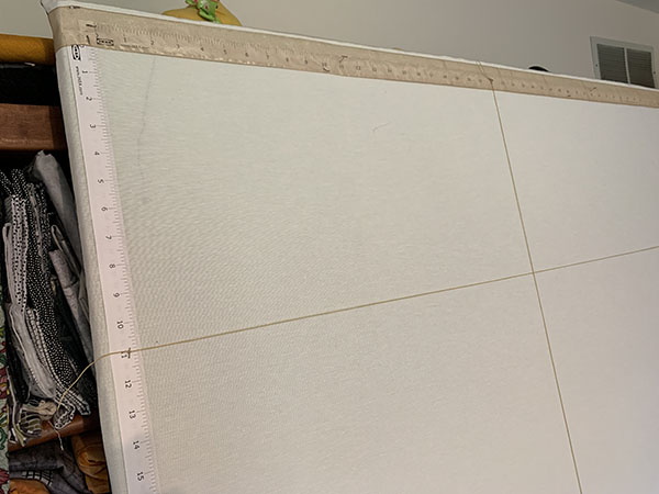
Design Grid
I chose a 4 x 6 grid, with 11-inch sides for my basic design grid. This will help me get all the key element in the right positions. I laid out scales using IKEA paper measuring tape spliced together (see bottom photo for zoom). Then I added gridlines with waxed string: see middle photo for final picture. Bonus: the waxed string can be felt through fabric.
design challenges - problems to solve
Before I jump into doing, I thought it would be a good idea to outline the key challenges in this quilt design as I see them… and my initial plans for handling them:
- Appliqué strategy (turned-under, or raw edge).
- Detail strategy for key elements: lettering, main car, shadow, background car, building details
- Layering sequence of background fabrics / quilt build-up
Let’s talk appliqué first. I’ve had a lot more experience with appliqué since I originally started this quilt. My preference is for turned edge appliqué, because it’s more robust and will hold up better with washing. However, raw edge appliqué may be the best choice for the palm trees. As long as the main cuts are on the bias, it won’t unravel. The problem is with thin strips cut along the grain – they will pull out and deteriorate with time and use.
a Detail Strategy (in order of preference):
- Turned-edge appliqué for main car and background cars, plus shadow.
- Turned-edge appliqué for all lettering… using apliquick method and tools (see apliquick.com).
- Thread painting / bobbin-work for additional background detail needed in gold and green layers. Perhaps small appliqués for larger areas if appropriate.
- Additional thread work or bobbin work for large appliqué details if needed… straight line, not satin stitch.
- Fabric painting if I’m absolutely desperate, or not happy with bobbin-work options. I prefer the effect of thread for quilt details.
Layer sequencing / build up:
- Blue fabric top, red ochre fabric bottom. This is the base layer… the two will be separated by the green and gold layers.
- Green hills layer gets added next, after details added in. Top edge only turned under, can be stitched to blue layer when placement is finalized.
- Gold building layer added next, after additional thread details added in. Top edge only turned under at first, and stitched to green layer when placement is finalized.
- Car appliqués must be finalized and laid out on quilt with all edges turned under. Once this is done, the location for the gold layer bottom-edge can be finalized and turned under, then stitched to the red ochre bottom layer.
- Background palm trees (lighter green)
- Top palm tree (darkest green)
- Lettering
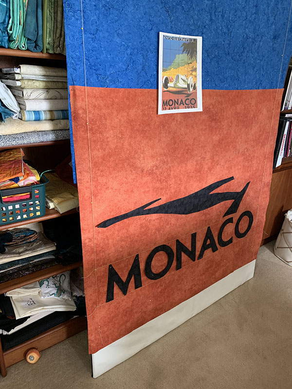
After that, the job is making sure everything is stitched well into place. I’m leaving my background fabrics trimmed to 50″ wide to ensure I have adequate margin for squaring off and trimming everything after all appliqués and design elements are in place. It could end up wider than 44″ wide… my car appliqué is currently looking a bit wide. This will give me ample margin to tweak my layout.
I have opted to use a modern font with a complimentary style, rather than duplicating Geo Hamel’s text. I’ve also decided to do the bottom text in black… it will make a more striking contrast with the background and balance well with the shadow under the car. The fonts are shown in the modified image, top left, superimposed over the original poster in black. Lettering will be white or light for the top letters.
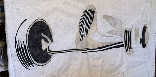
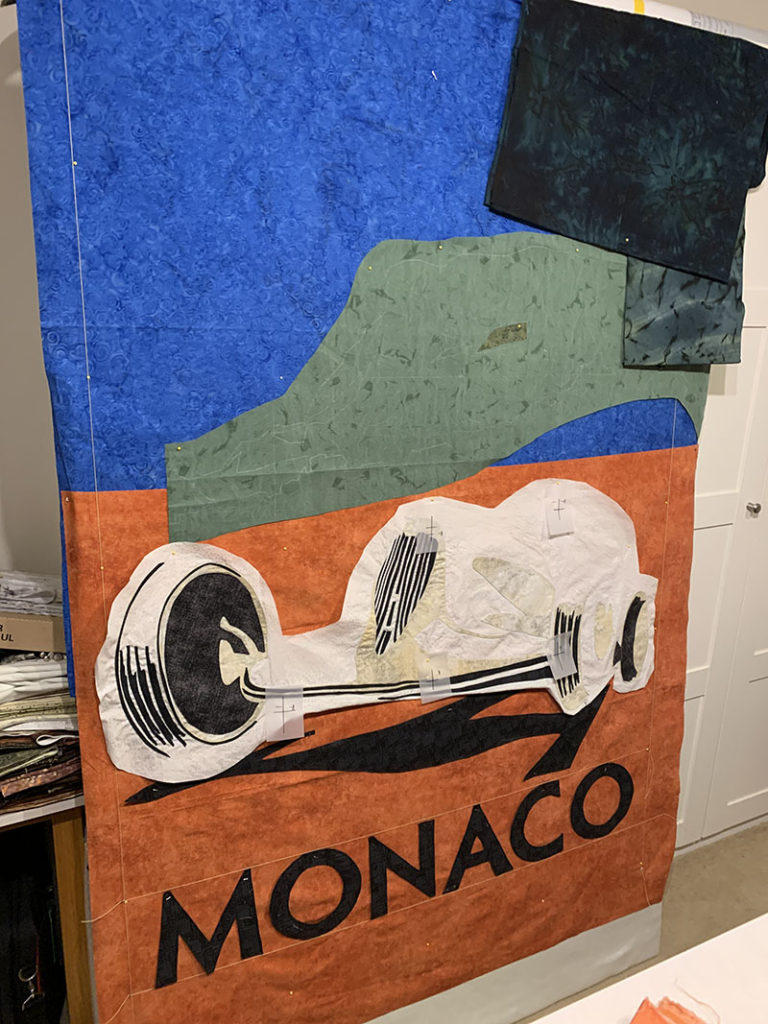
Current status of the car appliqué is shown at the bottom left.
Getting the major color blocks anchored
I actually chose two grid systems, the main one with 11″ square grids as shown previously, plus a secondary grid with mostly 8″ high by 11″ wide rectangles… for those sections for which I need to print onto the Sulky sticky fabri-Solvy or Stitch ‘N Wash sheets for bobbin work detail.
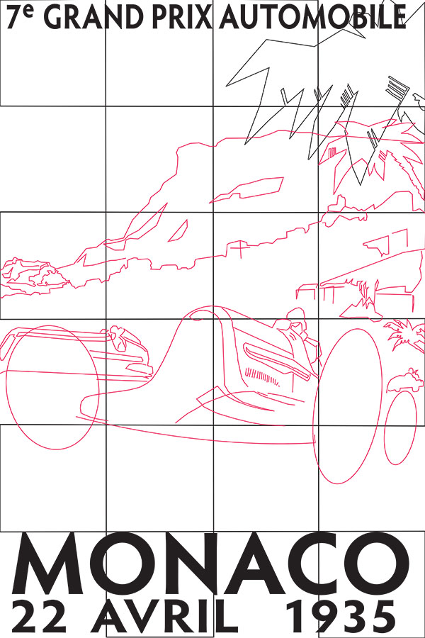
Before I get into that, I decided to use my new wide format inkjet printer and sheets of vellum to print my tiled grids out onto 12″ x 12″ square vellum paper. To save on ink and help me to transfer only the key details to fabric, I outlined the key shapes in Adobe Illustrator first, as shown at left.
This provides enough detail for me to mark the key profiles for the green and gold fabric landscape sections, as well as the palm trees.
My plan is to tape the vellum sections together, and use a light table to place the fabric over the background outlines. If I’m careful (and / or lucky), I may be able to use existing fabric details to capture some of the landscape details. I’ll mark the basic skyline profiles with a white soapstone or chalk pencil on the right side of the fabric, then do a rough turn-under of edges, pinning them in place to get the general effect. Then I’ll need to decide how much additional detail I need to add.
Based on prior experience, I may need to finalize these decisions after completing the car appliqué details.
Because I know that fabric distorts with the amount of stitching used, I won’t finalize the background cutting until I’m far enough along that I’ve added all the background detail I intend. It’s an iterative process. I may need to re-mark the skyline.
laying up main color blocks
As shown above, I simplified the design in Adobe Illustrator, then printed out key sections of the design on separate pieces of vellum, which I then taped together (see image bottom, left).
The vellum is translucent, and lets me view the fabric below, so I could try and place the fabric for maximum effect on the design.
Next step: mark the key features using transfer paper. For the green layer, I mark the skyline (top), the skyline of the gold layer (bottom), and any features I plan on using additional appliqués with. I also marked grid points to help me place the panel. Then I trimmed the fabric allowing ample allowance for turning under or overlapping with another layer.
For the car appliqué, I made crosses on scraps of vellum paper, then pinned them in place over the grid points for the car.
On the design wall itself, I inserted straight pins with round heads at the grid points, allowing me to feel the grid points easily through layers of fabric. This allowed me to get place the car fairly accurately on the design wall. Note… this appliqué is still a work in progress… much more detail needs to be added, and I have not turned any raw edges under. But you can start to see how the colors are coming together.
I’m not sure if the dark green is too dark for the palm tree… there are lighter shades in this fabric. I’ll have to do a test.
solvy stabilizer test
To test my idea of using a printed stabilizer to transfer details to fabric for additional bobbin work (stitching from the back side), or top-stitching, I tested two products on a fabric remnant.
See video (left) for details, and photos below–before and after rinsing, drying, & pressing.
Conclusion: although the Sulky product left no ink residue, I prefer not to risk using ink jet for marking transfers. This test simplified my design decisions. Time to move forward!